tidyquant 0.3.0: ggplot2 Enhancements, Real-Time Data, and More
Written
tidyquant, version 0.3.0, is a pretty sizable release that includes a little bit for everyone, including new financial charting and moving average geoms for use with ggplot2, a new tq_get get option called "key.stats" for retrieving real-time stock information, and several nice integrations that improve the ease of scaling your analyses. If your not already familiar with tidyquant, it integrates the best quantitative resources for collecting and analyzing quantitative data, xts, zoo, quantmod and TTR, with the tidyverse allowing for seamless interaction between each. I’ll briefly touch on some of the updates by going through some neat examples. The package is open source, and you can view the code on the tidyquant github page.
Table of Contents
v0.3.0 Updates
tidyquant: Bringing financial analysis to the tidyverse
When I said this was a big release, I wasn’t kidding. We have some major enhancements in tidyquant:
-
Financial Visualizations for ggplot2: Candlestick charts, barcharts, moving averages and Bollinger Bands can be used in the ggplot “grammar of graphics” workflow. There’s a new vignette, Charting with tidyquant, that details the new financial charting capabilities.
- Key stats from Yahoo Finance: Users can now get 55 different key statistics in real-time from Yahoo Finance with the new
"key.stats" get option. The statistics include Bid, Ask, Day’s High, Day’s Low, Last Trade Price, Current P/E Ratio, and many more most of which change throughout the day. With the addition of the key statistics, tq_get is now truly a one-stop shop for financial information. The user can now get:
- Real-time key stock statistics with
"key.stats"
- Historical key ratios and financial information over the past 10-years with
"key.ratios"
- Quarterly and annual financial statement data with
"financials"
- Historical daily stock prices with
"stock.prices"
- Stock indexes for 18 different indexes with
"stock.index"
- And more!
-
Enhancements that Make Scaling Financial Analysis Simple:
-
tq_get now accepts multiple stocks in the form of either a character vector (e.g. c("AAPL", "GOOG", "FB")) or a data frame with the stocks in the first column. This means scaling is ridiculously simple now. A call to tq_get(c("AAPL", "GOOG", "FB"), get = "stock.prices") now gets the 10-years of daily stock prices for all three stocks in one data frame!
-
tq_mutate and tq_transform now work with grouped data frames. This means that you can extend the xts, zoo, quantmod and TTR functions to grouped data frames the same way that you can with dplyr::mutate. In addition, you can now more easily rename the transformed / mutated data frame, with the col_rename argument. All of this saves you time and requires less code!
This concludes the major changes. Now, let’s go through some examples!
Prerequisites
First, update to tidyquant v0.3.0.
install.packages("tidyquant")
Next, load tidyquant.
# Loads tidyquant, tidyverse, lubridate, quantmod, TTR, xts, zoo
library(tidyquant)
I also recommend the open-source RStudio IDE, which makes R Programming easy and efficient.
Examples
We’ve got some neat examples to show off the new capabilities:
-
Enhanced Financial Data Visualizations: We’ll check out how to use the new tidyquant geoms with ggplot2, which provide great visualizations for time-series and stock data!
-
Working with Key Statistics: We’ll investigate the new tq_get get option, get = "key.stats", which enables access to real-time, intraday trading information!
-
Scaling Your Analysis: We’ll test out some of the new scaling features that make it even easier to scale your analysis from one security to many!
Example 1: Enhanced Financial Data Visualizations

I absolutely love these new ggplot geoms that come packaged with tidyquant, and I’m really excited to show them off! Two new chart types come packaged with tidyquant v0.3.0: geom_candlestick and geom_barchart (not to be confused with geom_bar). In this post, we’ll focus on the candlestick chart, but the barchart works in a very similar manner.
Before we start, let’s get some data using tq_get. The first call gets a single stock (nothing new here), and the second call retrieves the FANG stocks using the new scaling functionality by piping (%>%) a character vector of symbols to tq_get (there are other ways too!).
AMZN <- tq_get("AMZN", get = "stock.prices", from = "2007-01-01", to = "2017-01-01")
FANG <- c("FB", "AMZN", "NFLX", "GOOG") %>%
    tq_get(get = "stock.prices", from = "2007-01-01", to = "2017-01-01")
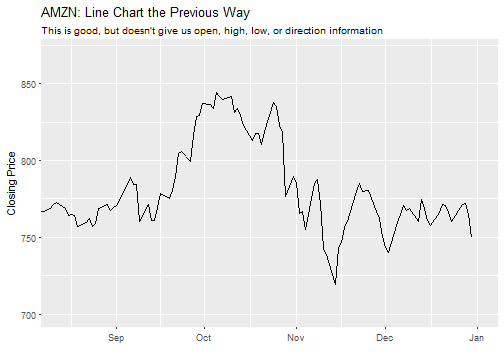
Before v0.3.0, we used geom_line to create a line chart like so. Note that coord_x_date is a new tidyquant coordinate function that enables zooming in a part of the chart without out-of-bounds data loss (scale_x_date is similar but causes out-of-bounds data loss which wreaks havoc on moving average geoms).
# Setup dates for zoom window
end <- ymd("2017-01-01")
start <- end - weeks(20)
# Create chart
AMZN %>%
    ggplot(aes(x = date, y = close)) +
    geom_line() +
    labs(title = "AMZN: Line Chart the Previous Way",
         subtitle = "This is good, but doesn't give us open, high, low, or direction information",
         x = "", y = "Closing Price") +
    coord_x_date(xlim = c(start, end),
                 ylim = c(700, 870))
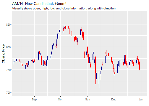
With tidyquant, we can replace the geom_line with geom_candlestick to create a beautiful candlestick chart that shows open, high, low, close, and direction visually. The only real difference is that we need to specify the aesthetic arguments, open, high, low and close. Everything else can stay the same.
AMZN %>%
    ggplot(aes(x = date, y = close)) +
    geom_candlestick(aes(open = open, close = close, high = high, low = low)) +
    labs(title = "AMZN: New Candlestick Geom!",
         subtitle = "Visually shows open, high, low, and close information, along with direction",
         x = "", y = "Closing Price") +
    coord_x_date(xlim = c(start, end),
                 ylim = c(700, 870))
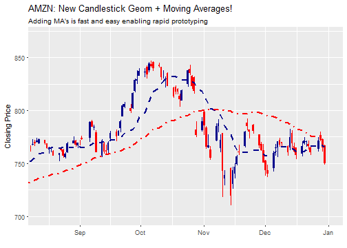
Pretty sweet! Let’s take this a step further with moving averages. The moving average geom, geom_ma, is used to quickly draw moving average lines using a moving average function, ma_fun, that is one of seven from the TTR package. We can use these to “rapid prototype” moving averages, enabling us to quickly identify changes in trends. Let’s add 15 and 50-day moving averages. Note that geom_ma takes arguments to control the moving average function (ma_fun = SMA and n = 15) and arguments to control the line such as color = "red" or linetype = 4.
AMZN %>%
    ggplot(aes(x = date, y = close)) +
    geom_candlestick(aes(open = open, close = close, high = high, low = low)) +
    geom_ma(ma_fun = SMA, n = 15, size = 1) +
    geom_ma(ma_fun = SMA, n = 50, color = "red", linetype = 4, size = 1) +
    labs(title = "AMZN: New Candlestick Geom + Moving Averages!",
         subtitle = "Adding MA's is fast and easy enabling rapid prototyping",
         x = "", y = "Closing Price") +
    coord_x_date(xlim = c(start, end),
                 ylim = c(700, 870))
We can also use Bollinger Bands to help visualize volatility. BBands take a moving average, such as ma_fun = SMA from TTR, and a standard deviation, sd = 2 by default. Because BBands depend on the high, low and close prices, we need to add these as aesthetic arguments. Let’s use a 20-day simple moving average with two standard deviations. We can see that there were two periods, one in October and one in November, that had higher volatility.
AMZN %>%
    ggplot(aes(x = date, y = close)) +
    geom_candlestick(aes(open = open, close = close, high = high, low = low)) +
    geom_bbands(aes(high = high, low = low, close = close),
                ma_fun = SMA, n = 20, sd = 2, size = 1) +
    labs(title = "AMZN: New Candlestick Geom + BBands!",
         subtitle = "Quickly visualize volatility",
         x = "", y = "Closing Price") +
    coord_x_date(xlim = c(start, end),
                 ylim = c(700, 870))
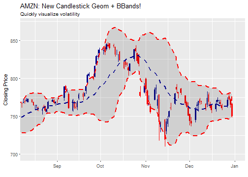
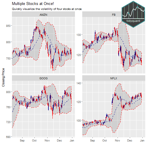
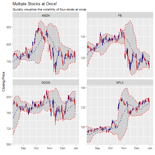
Last, we can visualize multiple stocks at once by adding a group aesthetic and tacking on a facet_wrap at the end of the ggplot workflow. Note that the out-of-bounds data becomes important to the scale of the facet: too much data and the y-axis is off scale, too little data and the moving average is thrown off. An easy way to adjust is to use filter() to subtract double the moving average number of periods (2 * n) from the start date of the data. This reduces the out-of-bounds data without eliminating data that the moving average function needs for calculations.
n <- 20
FANG %>%
    filter(date >= start - days(2 * n)) %>%
    ggplot(aes(x = date, y = close, group = symbol.x)) +
    geom_candlestick(aes(open = open, close = close, high = high, low = low)) +
    geom_bbands(aes(high = high, low = low, close = close),
                ma_fun = SMA, n = n, sd = 2, size = 0.5) +
    labs(title = "Multiple Stocks at Once!",
         subtitle = "Quickly visualize the volatility of four stocks at once",
         x = "", y = "Closing Price") +
    coord_x_date(xlim = c(start, end)) +
    facet_wrap(~ symbol.x, scales = "free_y")
Example 2: Working with Key Statistics
New to tq_get is the get option get = "key.stats". So, what are key stats? Yahoo Finance has an amazing list of real-time statistics such as bid price, ask price, day’s high, day’s low, change, and many more features that change throughout the day. Key stats are our access to live data, the most current features of a stock / company, many of which are accurate to the second that they are retrieved. Pretty neat!
Getting Key Stats
Let’s get some key stats, and see what’s inside. We get key stats using the tq_get function, setting get = "key.stats". When we show the data, it’s kind of messy (there’s a reason) so I’ve just listed the first ten column names. It comes in the form of a one row tibble (tidy data frame) that has 55 columns, one for each key stat.
AAPL_key_stats <- tq_get("AAPL", get = "key.stats")
colnames(AAPL_key_stats)[1:10]
##  [1] "Ask"
##  [2] "Ask.Size"
##  [3] "Average.Daily.Volume"
##  [4] "Bid"
##  [5] "Bid.Size"
##  [6] "Book.Value"
##  [7] "Change"
##  [8] "Change.From.200.day.Moving.Average"
##  [9] "Change.From.50.day.Moving.Average"
## [10] "Change.From.52.week.High"
The reason that the data comes this way is because, using the new scaling capability, we can get key stats for multiple stocks, and the rows get stacked on top of each other. This makes comparing key stats very easy!
c("FB", "AMZN", "NFLX", "GOOG") %>%
    tq_get(get = "key.stats") %>%
    select(symbol.x, Bid, Bid.Size, Ask, Ask.Size, Open, Change)
## # A tibble: 4 × 7
##   symbol.x    Bid Bid.Size    Ask Ask.Size   Open Change
##      <chr>  <dbl>    <int>  <dbl>    <int>  <dbl>  <dbl>
## 1       FB 127.00      300 127.07      100 128.10  -0.51
## 2     AMZN 807.52      100 808.73      100 815.28  -0.71
## 3     NFLX 138.30      100 138.60      300 139.36   0.19
## 4     GOOG 800.00      100 814.00      100 806.91   2.85
Retrieve Real-Time Data at Periodic Intervals
Something great about real-time data is that it can be collected at periodic intervals when trading is in-session! The following code chunk when run will retrieve stock prices at a periodic interval:
collect_real_time_data <- function(x, interval_sec, n) {
    data <- tibble()
    while (n > 0) {
        data <- bind_rows(data, tq_get(x, get = "key.stats"))
        Sys.sleep(interval_sec)
        n <- n - 1
    }
    return(data)
}
collect_real_time_data("AAPL", interval_sec = 3, n = 5) %>%
    select(Ask, Ask.Size, Bid, Bid.Size, Open, Change)
Comparing Historical Data to Current Data
We now have get = "key.stats" for current stats and with v0.2.0 we got get = "key.ratios" for 10-years of historical ratios. When combined, we can now compare current attributes to historical trends. To put into perspective, we will investigate the P/E Ratio: Comparing Historical Trends Versus Current Value for AAPL. The P/E ratio is a measure of the stock valuation. Stocks are considered “expensive” when they trade above historical averages or above industry averages.
We already have the key stats from AAPL, so getting the current P/E Ratio is very easy.
AAPL_key_stats$PE.Ratio
## [1] 14.44
Due to the amount of data and time-series nature, the key ratios come as a nested tibble, grouped by section type.
AAPL_key_ratios <- tq_get("AAPL", get = "key.ratios")
AAPL_key_ratios
## # A tibble: 7 × 2
##             section               data
##               <chr>             <list>
## 1        Financials <tibble [150 × 5]>
## 2     Profitability <tibble [170 × 5]>
## 3            Growth <tibble [160 × 5]>
## 4         Cash Flow  <tibble [50 × 5]>
## 5  Financial Health <tibble [240 × 5]>
## 6 Efficiency Ratios  <tibble [80 × 5]>
## 7  Valuation Ratios  <tibble [40 × 5]>
We need to get the historical P/E Ratios, which are in the “Valuation Ratios” section. We will do a series of filtering and unnesting to peel away the layers and isolate the “Price to Earnings” time-series data.
AAPL_historical_pe_ratios <- AAPL_key_ratios %>%
    filter(section == "Valuation Ratios") %>%
    unnest() %>%
    filter(category == "Price to Earnings") %>%
    select(category, date, value)
AAPL_historical_pe_ratios
## # A tibble: 10 × 3
##             category       date    value
##                <chr>     <date>    <dbl>
## 1  Price to Earnings 2007-12-31 46.02575
## 2  Price to Earnings 2008-12-31 11.44933
## 3  Price to Earnings 2009-12-31 21.09266
## 4  Price to Earnings 2010-12-31 19.43144
## 5  Price to Earnings 2011-12-30 13.34155
## 6  Price to Earnings 2012-12-31 11.07157
## 7  Price to Earnings 2013-12-31 13.29209
## 8  Price to Earnings 2014-12-31 16.46026
## 9  Price to Earnings 2015-12-31 11.16801
## 10 Price to Earnings 2016-12-30 13.93742
Now, we are ready to visualize the P/E Ratio: Comparing Historical Trends Versus Current Value for AAPL. The visualization below is inspired by r-statistics.co, an awesome resource for ggplot2 and R analysis. We add the following:
- Geoms:
geom_line() and geom_point() to chart the historical datageom_ma() to chart the three period simple moving average (the three period average helps identify the trend through the noise)geom_hline() to add a horizontal line at current P/E Ratio obtained from key stats.
- Legend: We manipulate the colors with
scale_color_manual() and the position in the theme() function.
- Logo: A logo is generated as a
grob (grid graphical object) using the grid and png packages. The function annotate_custom() allows us to simply add to the ggplot workflow. See Add an Image to Background for a tutorial.
library(ggplot2)
library(grid)
library(png)

img   <- png::readPNG("../img/tidyquant-logo.png")
g_pic <- grid::rasterGrob(img, interpolate=TRUE)

AAPL_historical_pe_ratios %>%
    ggplot(aes(x = date, y = value)) +
    geom_line(aes(color = "historical.pe"), size = 1) +
    geom_point(size = 3) +
    geom_ma(aes(color = "historical.ma"), ma_fun = SMA, n = 3, size = 1) +
    geom_hline(yintercept = AAPL_key_stats$PE.Ratio, color = "red", size = 1) +
    labs(title = "AAPL P/E Ratio: Comparing Historical Trends Versus Current Value",
         subtitle = "Awesome historical analysis is possible with the combo of get options: 'key.stats' + 'key.ratios'",
         y = "", x = "") +
    scale_colour_manual(name = 'Legend',
                        guide = 'legend',
                        values = c('historical.pe' = 'black',
                                   'historical.ma' = 'blue'),
                        labels = c('3-Year Moving Average',
                                   'Historical PE')) +
    annotate("text", label = "Current PE", x = ymd("2016-06-01"), y = 16,
             color = "red", size = 3.5) +
    theme_bw() +
    theme(legend.justification=c(1,1), legend.position=c(0.75, 0.85)) +
    annotation_custom(g_pic,
                      xmin = "2015-01-01" %>% ymd() %>% as.numeric(),
                      xmax = "2017-01-01" %>% ymd() %>% as.numeric(),
                      ymin = 30, ymax = 45)
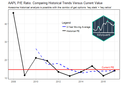
The chart shows that the current valuation is slightly above the recent historical valuation indicating that the stock prices is slightly “expensive”. However, given that the P/E ratio is below the current SP500 average of 25, courtesy of www.multpl.com, one could also consider this stock “inexpensive”. It just depends on your perspective. :)
Example 3: Scaling Your Analysis
Probably the single most important benefit of performing financial analysis in the tidyverse is the ability to scale. Based on some excellent feedback from @KanAugust, I have made scaling even easier. There’s two new options for scaling:
New Option 1: Passing a character vector of symbols:
Send a character vector in the form c("X", "Y", "Z") to tq_get. A new column is generated, symbol.x, with the symbols that were passed to the x argument.
c("FB", "GOOG", "AAPL") %>%
    tq_get(get = "stock.prices")
## # A tibble: 6,238 × 8
##    symbol.x       date  open  high   low close    volume adjusted
##       <chr>     <date> <dbl> <dbl> <dbl> <dbl>     <dbl>    <dbl>
## 1        FB 2012-05-18 42.05 45.00 38.00 38.23 573576400    38.23
## 2        FB 2012-05-21 36.53 36.66 33.00 34.03 168192700    34.03
## 3        FB 2012-05-22 32.61 33.59 30.94 31.00 101786600    31.00
## 4        FB 2012-05-23 31.37 32.50 31.36 32.00  73600000    32.00
## 5        FB 2012-05-24 32.95 33.21 31.77 33.03  50237200    33.03
## 6        FB 2012-05-25 32.90 32.95 31.11 31.91  37149800    31.91
## 7        FB 2012-05-29 31.48 31.69 28.65 28.84  78063400    28.84
## 8        FB 2012-05-30 28.70 29.55 27.86 28.19  57267900    28.19
## 9        FB 2012-05-31 28.55 29.67 26.83 29.60 111639200    29.60
## 10       FB 2012-06-01 28.89 29.15 27.39 27.72  41855500    27.72
## # ... with 6,228 more rows
New Option 2: Passing a tibble with symbols in the first column:
We can combine tq_get calls using get = "stock.index" and get = "stock.prices" to pass a stock index to get stock prices. I’ve added slice(1:3) to get the first three stocks from the index, which reduces the download time. If you remove slice(1:3), you will get the historical prices for all stocks in an index in the next step!
First, get stocks from an index.
NASDAQ_first_three <- tq_get("NASDAQ100", get = "stock.index") %>%
    slice(1:3)
NASDAQ_first_three
## # A tibble: 3 × 2
##   symbol             company
##    <chr>               <chr>
## 1    MMM                  3M
## 2    ABT ABBOTT LABORATORIES
## 3   ABBV          ABBVIE INC
Then get stock prices. Note that symbols must be in the first column.
NASDAQ_first_three <- NASDAQ_first_three %>%
    tq_get(get = "stock.prices")
NASDAQ_first_three
## # A tibble: 6,083 × 9
##    symbol company       date  open  high   low close  volume adjusted
##     <chr>   <chr>     <date> <dbl> <dbl> <dbl> <dbl>   <dbl>    <dbl>
## 1     MMM      3M 2007-01-03 77.53 78.85 77.38 78.26 3781500 60.31064
## 2     MMM      3M 2007-01-04 78.40 78.41 77.45 77.95 2968400 60.07174
## 3     MMM      3M 2007-01-05 77.89 77.90 77.01 77.42 2765200 59.66330
## 4     MMM      3M 2007-01-08 77.42 78.04 76.97 77.59 2434500 59.79431
## 5     MMM      3M 2007-01-09 78.00 78.23 77.44 77.68 1896800 59.86367
## 6     MMM      3M 2007-01-10 77.31 77.96 77.04 77.85 1787500 59.99468
## 7     MMM      3M 2007-01-11 78.05 79.03 77.88 78.65 2372500 60.61120
## 8     MMM      3M 2007-01-12 78.41 79.50 78.22 79.36 2582200 61.15835
## 9     MMM      3M 2007-01-16 79.48 79.62 78.92 79.56 2526600 61.31248
## 10    MMM      3M 2007-01-17 79.33 79.51 78.75 78.91 2711300 60.81156
## # ... with 6,073 more rows
We can also use tq_mutate and tq_transform with dplyr::group_by to scale analyses! Thanks to some great feedback from @dvaughan32, the col_rename argument is available to conveniently rename the newly transformed / mutated columns.
NASDAQ_first_three %>%
    group_by(symbol) %>%
    tq_mutate(ohlc_fun = Ad, mutate_fun = SMA, n = 5, col_rename = "SMA.5") %>%
    select(-(open:volume))
## Source: local data frame [6,083 x 5]
## Groups: symbol [3]
##
##    symbol company       date adjusted    SMA.5
##     <chr>   <chr>     <date>    <dbl>    <dbl>
## 1     MMM      3M 2007-01-03 60.31064       NA
## 2     MMM      3M 2007-01-04 60.07174       NA
## 3     MMM      3M 2007-01-05 59.66330       NA
## 4     MMM      3M 2007-01-08 59.79431       NA
## 5     MMM      3M 2007-01-09 59.86367 59.94073
## 6     MMM      3M 2007-01-10 59.99468 59.87754
## 7     MMM      3M 2007-01-11 60.61120 59.98543
## 8     MMM      3M 2007-01-12 61.15835 60.28444
## 9     MMM      3M 2007-01-16 61.31248 60.58807
## 10    MMM      3M 2007-01-17 60.81156 60.77765
## # ... with 6,073 more rows
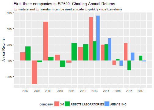
Here’s a powerful example: We can use group_by and tq_transform to collect annual returns for a tibble of stock prices for multiple stocks. The result can be piped to ggplot for charting.
NASDAQ_first_three %>%
    group_by(company) %>%
    tq_transform(Ad, periodReturn, period = "yearly", col_rename = "Annual.Returns") %>%
    ggplot(aes(x = year(date), y = Annual.Returns, fill = company)) +
    geom_bar(position = "dodge", stat = "identity") +
    scale_y_continuous(labels = scales::percent) +
    scale_x_continuous(breaks = seq(2007, 2017, by = 1)) +
    labs(title = "First three companies in SP500: Charting Annual Returns",
         subtitle = "tq_mutate and tq_transform can be used at scale to quickly visualize returns",
         x = "") +
    theme(legend.position = "bottom")
Conclusions
The tidyquant package has several enhancements for financial analysis:
-
New ggplot2 geoms for candlestick charts, barcharts, moving averages, and Bollinger Bands, and a brand new vignette to help guide users on charting capabilities.
-
New get = "key.stats" for current stats on stocks: 55 total are available. The key stats compliment the key ratios (`get = “key.ratios”), which contain 10-years of historical information on various key ratios and financial information.
-
New capabilities for scaling financial analyses to many stocks:
- Using
tq_get with character vectors or tibbles of stocks
- Using
tq_mutate / tq_transform with dplyr::group_by
With these updates, we can really do full financial analyses without ever leaving the tidyverse!
Recap
We went over a few examples to illustrate the main updates to tidyquant:
-
The first example showed an implementation of several new tidyquant geoms that work with ggplot2: geom_candlestick / geom_barchart, geom_ma, and geom_bbands.
-
The second example showed use of the new tq_get get option, get = "key.stats". The key stats provide real-time data from Yahoo Finance, and are a handy complement to the historical data provided using get options, "stock.prices", "key.ratios", and "financials".
-
The third and final example showed some of the improvements in scaling analysis with the tidyverse. You can now pipe multiple symbols into tq_get to scale any of the get options, and you can use tq_mutate and tq_transform with dplyr::group_by.
I hope you enjoy the new features as much as I did creating them. As always there’s more to come! :)
Further Reading
-
r-statistics.co: You need to check out this website, which contains a wealth of quality, up-to-date R information. The Top 50 ggplot2 visualizations is amazing. This is now my go-to reference on ggplot2.
-
Tidyquant Vignettes: This tutorial just scratches the surface of tidyquant. The vignettes explain much, much more!
-
R for Data Science: A free book that thoroughly covers the tidyverse packages.
-
Quantmod Website: Covers many of the quantmod functions. Also, see the quantmod CRAN site.
-
Extensible Time-Series Website: Covers many of the xts functions. Also, see the xts vignette.
-
TTR on CRAN: The reference manual covers each of the TTR functions.
-
Zoo Vignettes: Covers the zoo rollapply functions as well as other usage.