It's tibbletime v0.0.2: Time-Aware Tibbles, New Functions, Weather Analysis and More
Written by Davis Vaughan
Today we are introducing tibbletime v0.0.2, and we’ve got a ton of new features in store for you. We have functions for converting to flexible time periods with the ~period formula~ and making/calculating custom rolling functions with rollify() (plus a bunch more new functionality!). We’ll take the new functionality for a spin with some weather data (from the weatherData package). However, the new tools make tibbletime useful in a number of broad applications such as forecasting, financial analysis, business analysis and more! We truly view tibbletime as the next phase of time series analysis in the tidyverse. If you like what we do, please connect with us on social media to stay up on the latest Business Science news, events and information!
Introduction

We are excited to announce the release of tibbletime v0.0.2 on CRAN. Loads of new
functionality have been added, including:
-
Generic period support: Perform time-based calculations by a number
of supported periods using a new ~period formula~.
-
Creating series: Use create_series() to quickly create a tbl_time
object initialized with a regular time series.
-
Rolling calculations: Turn any function into a rolling version of itself with
rollify().
-
A number of smaller tweaks and helper functions to make life easier.
As we further develop tibbletime, it is becoming clearer that the package
is a tool that should be used in addition to the rest of the tidyverse.
The combination of the two makes time series analysis in the tidyverse much easier to do!
In this post
Today we will take a look at weather data for New York and San
Francisco from 2013. It will be an exploratory analysis
to show off some of the new features in tibbletime, but the package
itself has much broader application. As we will see, tibbletime’s time-based
functionality can be a valuable data manipulation tool to help with:
-
Product and sales forecasting
-
Financial analysis with custom rolling functions
-
Grouping data into time buckets to analyze change over time, which is great for any part of an organization including sales, marketing, manufacturing, and HR!
Data and packages
The datasets used are from a neat package called weatherData. While weatherData has functionality to pull weather data for a number of cities, we will use the built-in datasets. We encourage you to explore the weatherData API if you’re interested in collecting weather data.
To get started, load the following packages:
tibbletime: Time-aware tibbles for the tidyversetidyverse: Loads packages including dplyr, tidyr, purrr, and ggplotcorrr: Tidy correlationsweatherData: Slick package for getting weather data
Also, load the datasets from weatherData, “NewYork2013” and “SFO2013”.
# Load libraries
library(tibbletime)  # Make sure you have 0.0.2 from CRAN!
library(tidyverse)
library(corrr)
library(weatherData)

# Load weatherData datasets
NYC <- NewYork2013
SFO <- SFO2013
Combine and convert
To tidy up, we first join our data sets together using bind_rows(). Passing
a named list of tibbles along with specifying the .id argument allows
bind_rows() to create a new City reference column for us.
# Tidying up the weather data
weather <- bind_rows(list(NYC = NYC, SFO = SFO), .id = "City") %>%
  as_tibble()
weather
## # A tibble: 19,706 x 3
##     City                Time Temperature
##    <chr>               <chr>       <dbl>
##  1   NYC 2013-01-01 00:51:00        41.0
##  2   NYC 2013-01-01 01:51:00        39.9
##  3   NYC 2013-01-01 02:51:00        41.0
##  4   NYC 2013-01-01 03:51:00        41.0
##  5   NYC 2013-01-01 04:51:00        41.0
##  6   NYC 2013-01-01 05:51:00        39.9
##  7   NYC 2013-01-01 06:51:00        39.9
##  8   NYC 2013-01-01 07:51:00        39.9
##  9   NYC 2013-01-01 08:51:00        39.9
## 10   NYC 2013-01-01 09:51:00        39.9
## # ... with 19,696 more rows
Next, we will convert to tbl_time and group by our City variable. Note that we know this is a tbl_time object by Index: Time that gets printed along with the tibble.
# Convert to tbl_time class
weather <- weather %>%
  mutate(Time = as.POSIXct(Time)) %>%
  as_tbl_time(Time) %>%
  group_by(City)

weather
## # A time tibble: 19,706 x 3
## # Index:  Time
## # Groups: City [2]
##     City                Time Temperature
##  * <chr>              <dttm>       <dbl>
##  1   NYC 2013-01-01 00:51:00        41.0
##  2   NYC 2013-01-01 01:51:00        39.9
##  3   NYC 2013-01-01 02:51:00        41.0
##  4   NYC 2013-01-01 03:51:00        41.0
##  5   NYC 2013-01-01 04:51:00        41.0
##  6   NYC 2013-01-01 05:51:00        39.9
##  7   NYC 2013-01-01 06:51:00        39.9
##  8   NYC 2013-01-01 07:51:00        39.9
##  9   NYC 2013-01-01 08:51:00        39.9
## 10   NYC 2013-01-01 09:51:00        39.9
## # ... with 19,696 more rows
Period conversion
The first new idea to introduce is the ~period formula~. This tells the tibbletime functions how you want to time-group your data. It is specified
as multiple ~ period, with examples being 1~d for “every 1 day,” and
4~m for “every 4 months.”
# Changing to 1 row every 2 days.
# The minimum date per interval is selected by default
as_period(weather, 2~d)
## # A time tibble: 366 x 3
## # Index:  Time
## # Groups: City [2]
##     City                Time Temperature
##  * <chr>              <dttm>       <dbl>
##  1   NYC 2013-01-01 00:51:00        41.0
##  2   NYC 2013-01-03 00:51:00        30.0
##  3   NYC 2013-01-05 00:51:00        36.0
##  4   NYC 2013-01-07 00:51:00        42.1
##  5   NYC 2013-01-09 00:51:00        39.2
##  6   NYC 2013-01-11 00:51:00        39.0
##  7   NYC 2013-01-13 00:46:00        42.8
##  8   NYC 2013-01-15 00:51:00        39.0
##  9   NYC 2013-01-17 00:51:00        39.0
## 10   NYC 2013-01-19 00:51:00        30.9
## # ... with 356 more rows
In our original data, it looks like weather is an hourly dataset, with each new
data point coming in on the 51st minute of the hour for NYC and the 56th minute
for SFO. Unfortunately, a number of points don’t follow this. Check out the following rows:
# Problem: Some timestamp points don't follow hourly pattern
slice(weather, 12:14)
## # A time tibble: 6 x 3
## # Index:  Time
## # Groups: City [2]
##    City                Time Temperature
## * <chr>              <dttm>       <dbl>
## 1   NYC 2013-01-01 11:51:00        39.9
## 2   NYC 2013-01-01 12:18:00        37.4
## 3   NYC 2013-01-01 12:51:00        37.9
## 4   SFO 2013-01-01 08:56:00        45.0
## 5   SFO 2013-01-01 09:56:00        46.9
## 6   SFO 2013-01-01 10:56:00        46.0
What we want is 1 row per hour, and in this case we get two rows for NYC hour 12.
We can use as_period() to ensure that we only have 1 row for each hour
# Get 1 row per hour with as_period()
weather <- as_period(weather, 1~h)

slice(weather, 12:14)
## # A time tibble: 6 x 3
## # Index:  Time
## # Groups: City [2]
##    City                Time Temperature
## * <chr>              <dttm>       <dbl>
## 1   NYC 2013-01-01 11:51:00        39.9
## 2   NYC 2013-01-01 12:18:00        37.4
## 3   NYC 2013-01-01 13:51:00        37.9
## 4   SFO 2013-01-01 11:56:00        48.9
## 5   SFO 2013-01-01 12:56:00        51.1
## 6   SFO 2013-01-01 13:56:00        52.0
Now that we have our data in an hourly format, we probably don’t care about
which minute it came in on. We can floor the date column using a helper function,
time_floor(). Credit to Hadley Wickham because this is essentially a convenient
wrapper around lubridate::floor_date(). Setting the period to 1~h floors
each row to the beginning of the last hour.
# Time floor: Shift timestamps to a time-based floor
weather <- time_floor(weather, 1~h)
weather
## # A time tibble: 17,489 x 3
## # Index:  Time
## # Groups: City [2]
##     City                Time Temperature
##  * <chr>              <dttm>       <dbl>
##  1   NYC 2013-01-01 00:00:00        41.0
##  2   NYC 2013-01-01 01:00:00        39.9
##  3   NYC 2013-01-01 02:00:00        41.0
##  4   NYC 2013-01-01 03:00:00        41.0
##  5   NYC 2013-01-01 04:00:00        41.0
##  6   NYC 2013-01-01 05:00:00        39.9
##  7   NYC 2013-01-01 06:00:00        39.9
##  8   NYC 2013-01-01 07:00:00        39.9
##  9   NYC 2013-01-01 08:00:00        39.9
## 10   NYC 2013-01-01 09:00:00        39.9
## # ... with 17,479 more rows
Visualize the data
Now that we have cleaned up a bit, let’s visualize the data.
# Yikes: Hourly is a bit too much data for the chart
ggplot(weather, aes(x = Time, y = Temperature, color = City)) +
  geom_line() +
  theme_minimal()
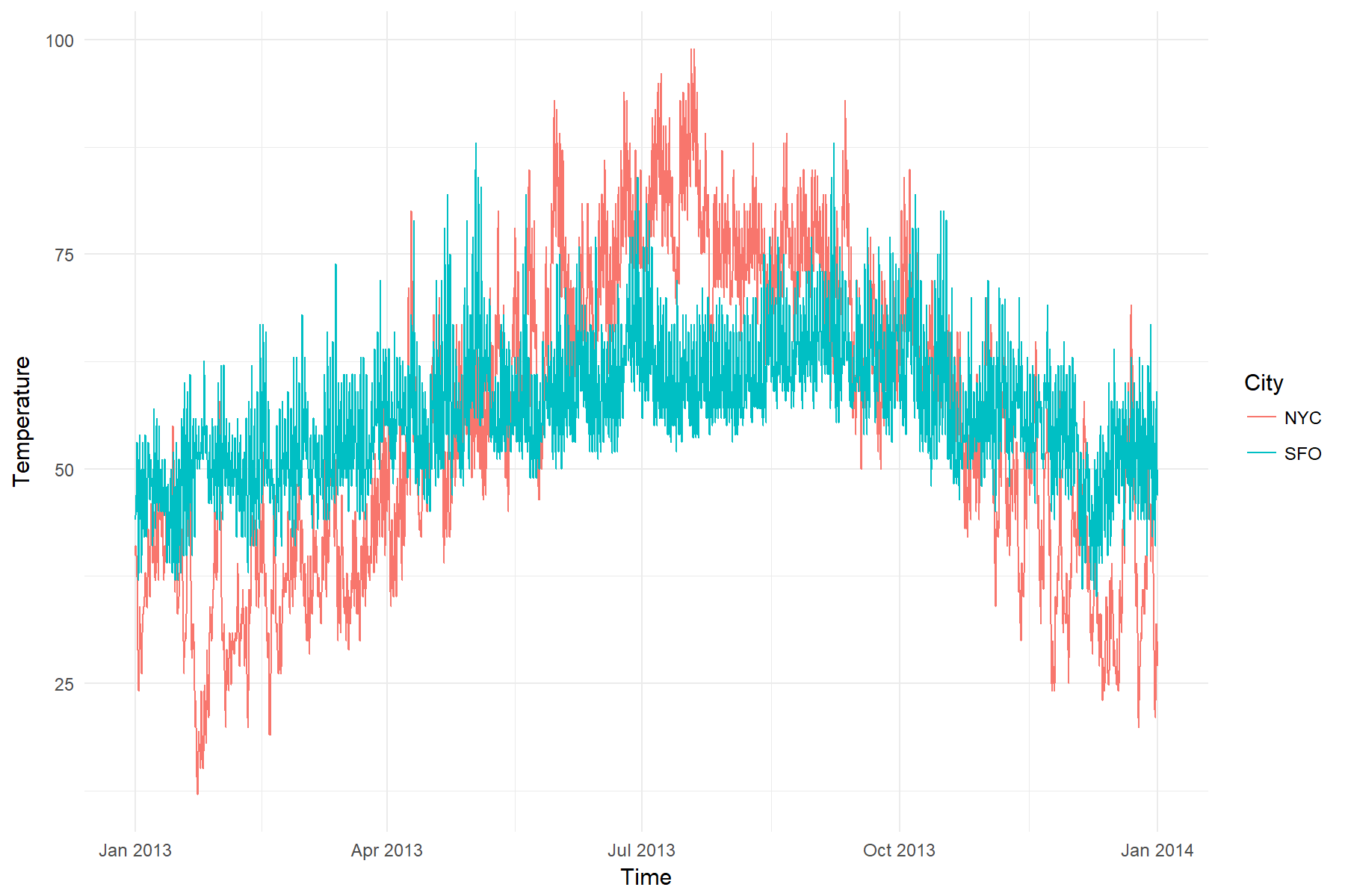
Seems like hourly data is a bit overwhelming for this kind of chart. Let’s
convert to daily and try again.
# Convert to daily makes the plot much more readable
weather %>%
  as_period(1~d) %>%
  ggplot(aes(x = Time, y = Temperature, color = City)) +
  geom_line() +
  theme_minimal()
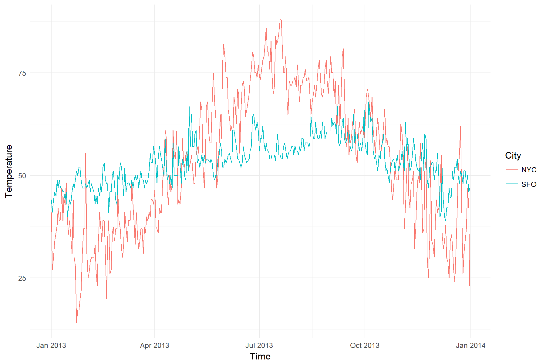
That’s better. It looks like NYC has a much wider range of temperatures than
SFO. Both seem to be hotter in summer months.
Period-based summaries
The dplyr::summarise() function is very useful for taking grouped summaries.
time_summarise() takes this a step further by allowing you to summarise by
period.
Below we take a look at the average and standard deviation of the temperatures
calculated at monthly and bimonthly intervals.
# Weather average by 1 month (monthly)
weather_avg <- weather %>%
  # Monthly average / sd
  time_summarise(1~m,
          avg = mean(Temperature),
          sd  = sd(Temperature))
weather_avg
## # A time tibble: 24 x 4
## # Index:  Time
## # Groups: City [2]
##     City                Time      avg       sd
##  * <chr>              <dttm>    <dbl>    <dbl>
##  1   NYC 2013-01-31 23:00:00 35.91238 9.855091
##  2   NYC 2013-02-28 23:00:00 34.28445 6.670289
##  3   NYC 2013-03-31 23:00:00 39.96095 5.977762
##  4   NYC 2013-04-30 23:00:00 52.08597 8.452899
##  5   NYC 2013-05-31 23:00:00 62.65565 9.884137
##  6   NYC 2013-06-30 23:00:00 73.25931 7.583734
##  7   NYC 2013-07-31 23:00:00 80.70498 7.268836
##  8   NYC 2013-08-31 23:00:00 75.01752 4.783213
##  9   NYC 2013-09-30 23:00:00 67.88597 8.102304
## 10   NYC 2013-10-31 23:00:00 60.51425 8.165931
## # ... with 14 more rows
# Weather average by 2 months (bimonthly)
weather_2m_avg <- weather %>%
  # Bimonthly average / sd
  time_summarise(2~m,
                 avg = mean(Temperature),
                 sd  = sd(Temperature))

weather_2m_avg
## # A time tibble: 12 x 4
## # Index:  Time
## # Groups: City [2]
##     City                Time      avg        sd
##  * <chr>              <dttm>    <dbl>     <dbl>
##  1   NYC 2013-02-28 23:00:00 35.14108  8.532226
##  2   NYC 2013-04-30 23:00:00 45.94041  9.491227
##  3   NYC 2013-06-30 23:00:00 67.87056 10.295737
##  4   NYC 2013-08-31 23:00:00 77.86316  6.777490
##  5   NYC 2013-10-31 23:00:00 64.13969  8.928570
##  6   NYC 2013-12-31 23:00:00 41.69274 10.711184
##  7   SFO 2013-02-28 23:00:00 49.26967  4.901310
##  8   SFO 2013-04-30 23:00:00 54.79945  6.072042
##  9   SFO 2013-06-30 23:00:00 59.95865  6.529238
## 10   SFO 2013-08-31 23:00:00 61.63802  5.163107
## 11   SFO 2013-10-31 23:00:00 61.38558  6.923694
## 12   SFO 2013-12-31 23:00:00 53.05468  6.346301
A closer look at July
July seemed to be one of the hottest months for NYC, let’s take a closer look at it.
To just grab July dates, use time_filter(). If you haven’t seen this before, a time formula is used to specify the dates to filter for. The one-sided formula below expands to include dates between, 2013-07-01 00:00:00 ~ 2013-07-31 23:59:59.
july <- weather %>%
  time_filter(~2013-7)

july
## # A time tibble: 1,486 x 3
## # Index:  Time
## # Groups: City [2]
##     City                Time Temperature
##  * <chr>              <dttm>       <dbl>
##  1   NYC 2013-07-01 00:00:00        73.4
##  2   NYC 2013-07-01 01:00:00        73.9
##  3   NYC 2013-07-01 02:00:00        73.4
##  4   NYC 2013-07-01 03:00:00        73.9
##  5   NYC 2013-07-01 04:00:00        73.9
##  6   NYC 2013-07-01 05:00:00        73.9
##  7   NYC 2013-07-01 06:00:00        75.9
##  8   NYC 2013-07-01 07:00:00        75.9
##  9   NYC 2013-07-01 08:00:00        75.2
## 10   NYC 2013-07-01 09:00:00        77.0
## # ... with 1,476 more rows
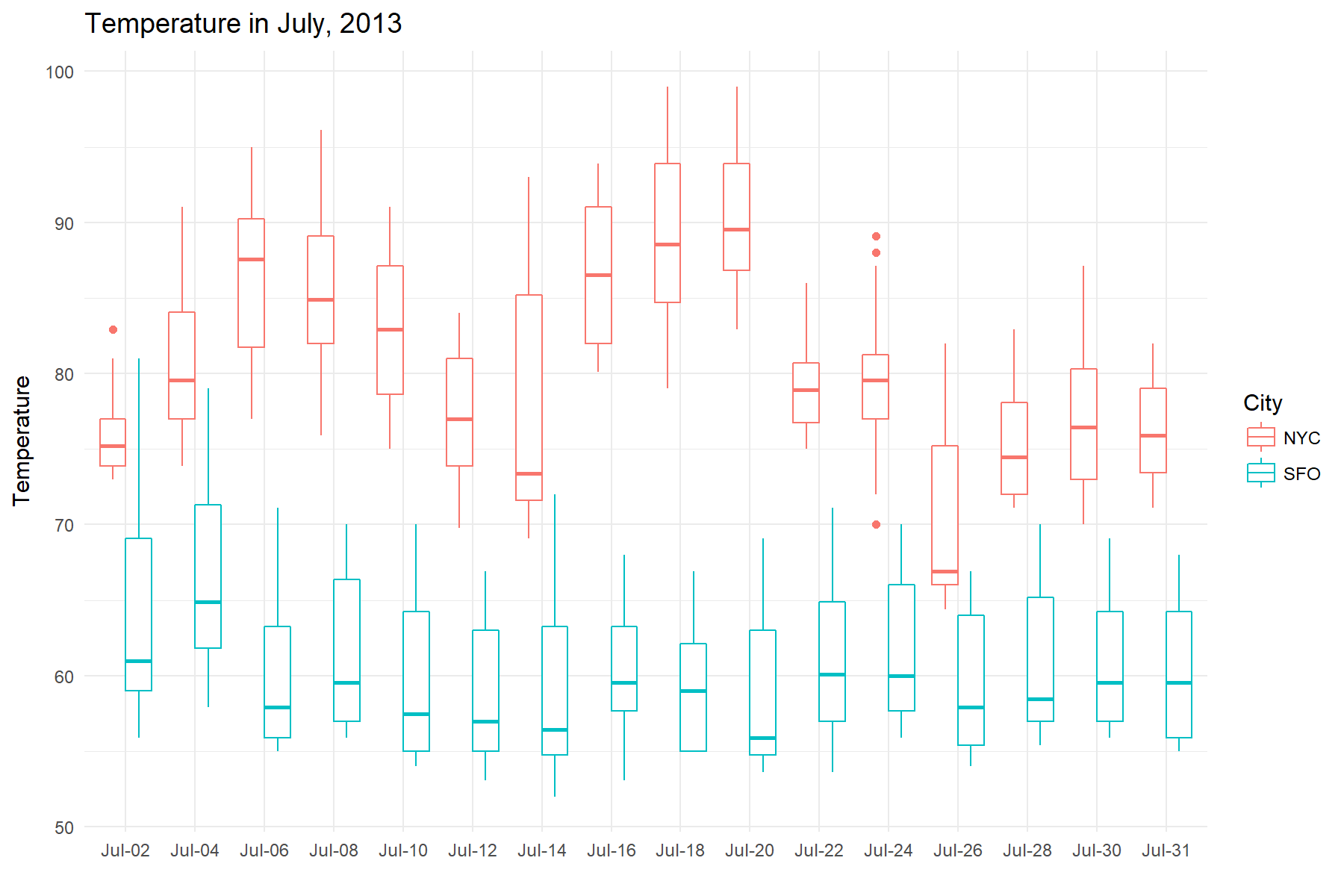
To visualize July’s weather, we will make a boxplot of the temperatures.
Specifically, we will slice July into intervals of 2 days, and create a series
of boxplots based on the data inside those intervals. To do this, we will
use time_collapse(), which collapses a column of dates into a column of the same
lenth, but where every row in a time interval shares the same date. You can use this resulting
column for further grouping or labeling operations.
# Every row where the date falls between
# (2013-07-01 00:00:00, 2013-07-02 23:59:59)
# shares the same date, and so on for the entire series
july_collapsed <- july %>% time_collapse(2~d)
july_collapsed
## # A time tibble: 1,486 x 3
## # Index:  Time
## # Groups: City [2]
##     City                Time Temperature
##  * <chr>              <dttm>       <dbl>
##  1   NYC 2013-07-02 23:00:00        73.4
##  2   NYC 2013-07-02 23:00:00        73.9
##  3   NYC 2013-07-02 23:00:00        73.4
##  4   NYC 2013-07-02 23:00:00        73.9
##  5   NYC 2013-07-02 23:00:00        73.9
##  6   NYC 2013-07-02 23:00:00        73.9
##  7   NYC 2013-07-02 23:00:00        75.9
##  8   NYC 2013-07-02 23:00:00        75.9
##  9   NYC 2013-07-02 23:00:00        75.2
## 10   NYC 2013-07-02 23:00:00        77.0
## # ... with 1,476 more rows
Let’s visualize to see if we can gain any insights. Wow, San Fran maintained a constant cool average of 60 degrees in the hottest month
of the year!
# Plot Temperature in July
july_collapsed %>%
  ggplot(aes(x = reorder(format(Time, '%b-%d'), Time),
             y = Temperature, color = City)) +
  geom_boxplot() +
  labs(x = "", title = "Temperature in July, 2013") +
  theme_minimal()
Period and rolling correlations
Finally, we will look at the correlation of temperatures in our two cities in a few different ways.
First, let’s look at the overall correlation. The corrr package provides a nice way to accomplish this with data frames.
weather %>%
  spread(key = City, value = Temperature) %>%
  select(NYC, SFO) %>%
  corrr::correlate()
## # A tibble: 2 x 3
##   rowname       NYC       SFO
##     <chr>     <dbl>     <dbl>
## 1     NYC        NA 0.6510299
## 2     SFO 0.6510299        NA
Next, let’s look at monthly correlations. The general idea will be
to nest each month into it’s own data frame, apply correlate() to each
nested data frame, and then unnest the results. We will use time_nest() to easily perform the monthly nesting.
monthly_nest <- weather %>%
  spread(key = City, value = Temperature) %>%

  # Nest by month, don't add the original dates to the inner tibbles
  time_nest(1~m, keep_inner_dates = FALSE)

monthly_nest
## # A time tibble: 12 x 2
## # Index: Time
##                   Time               data
##  *              <dttm>             <list>
##  1 2013-01-31 23:00:00 <tibble [744 x 2]>
##  2 2013-02-28 23:00:00 <tibble [672 x 2]>
##  3 2013-03-31 23:00:00 <tibble [743 x 2]>
##  4 2013-04-30 23:00:00 <tibble [720 x 2]>
##  5 2013-05-31 23:00:00 <tibble [744 x 2]>
##  6 2013-06-30 23:00:00 <tibble [720 x 2]>
##  7 2013-07-31 23:00:00 <tibble [744 x 2]>
##  8 2013-08-31 23:00:00 <tibble [744 x 2]>
##  9 2013-09-30 23:00:00 <tibble [720 x 2]>
## 10 2013-10-31 23:00:00 <tibble [744 x 2]>
## 11 2013-11-30 23:00:00 <tibble [719 x 2]>
## 12 2013-12-31 23:00:00 <tibble [744 x 2]>
For each month, calculate the correlation tibble and then focus() on the NYC column. Then unnest and floor the results.
monthly_nest %>%
  mutate(monthly_cor = map(data, ~corrr::correlate(.x) %>%
                               corrr::focus(NYC))
         ) %>%
  unnest(monthly_cor) %>%
  time_floor(1~d)
## # A time tibble: 12 x 4
## # Index: Time
##          Time               data rowname         NYC
##  *     <dttm>             <list>   <chr>       <dbl>
##  1 2013-01-31 <tibble [744 x 2]>     SFO -0.10281153
##  2 2013-02-28 <tibble [672 x 2]>     SFO  0.38288119
##  3 2013-03-31 <tibble [743 x 2]>     SFO  0.52432022
##  4 2013-04-30 <tibble [720 x 2]>     SFO  0.34258085
##  5 2013-05-31 <tibble [744 x 2]>     SFO  0.07814153
##  6 2013-06-30 <tibble [720 x 2]>     SFO  0.52024900
##  7 2013-07-31 <tibble [744 x 2]>     SFO  0.29163801
##  8 2013-08-31 <tibble [744 x 2]>     SFO  0.45479643
##  9 2013-09-30 <tibble [720 x 2]>     SFO  0.48056194
## 10 2013-10-31 <tibble [744 x 2]>     SFO  0.59429495
## 11 2013-11-30 <tibble [719 x 2]>     SFO  0.35513490
## 12 2013-12-31 <tibble [744 x 2]>     SFO  0.17559596
It seems that summer and fall months tend to have higher correlation than colder months.
And finally we will calculate the rolling correlation of NYC and SFO temperatures. The “width” of our roll will be monthly, or 360 hours since we are in hourly format.
There are a number of ways to do this, but for this example
we introduce rollify(), which takes any function that you give it and creates a rolling version of it. The first argument to rollify() is the function that you want to modify, and it is passed to rollify() in the same way that you would pass a function to purrr::map(). The second argument is the window size. Call the rolling function just as you would call a non-rolling version
of cor() from inside mutate().
# Rolling custom functions with rollify()
rolling_cor <- rollify(~cor(.x, .y, use = "pairwise.complete.obs"),
                       window = 360)

weather_rol_cor <- weather %>%
  spread(key = City, value = Temperature) %>%

  # Mutate with a rolling function!
  mutate(rolling_cor = rolling_cor(NYC, SFO))

# Plot it!
ggplot(weather_rol_cor, aes(x = Time, y = rolling_cor)) +
  geom_line() +
  labs(x = "Date", y = "Rolling correlation", title = "1 month rolling correlation of NYC and SFO temperatures") +
  theme_minimal()
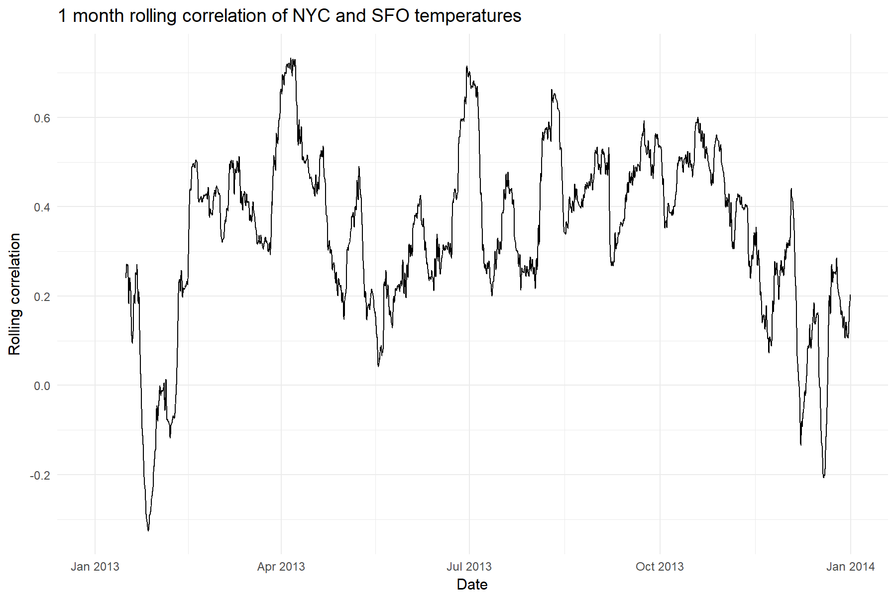
It looks like the correlation is definitely not stable throughout the year,
so that initial correlation value of .65 definitely has to be taken
with a grain of salt!
Rolling Functions: Pros/Cons and Recommendations
There are a number of ways to do rolling functions, and we recommend based on your needs. If you are interested in:
-
Flexibility: Use rollify(). You can literally turn any function into a “tidy” rolling function. Think everything from rolling statistics to rolling regressions. Whatever you can dream up, it can do. The speed is fast, but not quite as fast as other Rcpp based libraries.
-
Performance: Use the roll package, which uses RcppParallel as its backend making it the fastest option available. The only downside is flexibility since you cannot create custom rolling functions and are bound to those available.
Wrapping up
We’ve touched on a few of the new features in tibbletime v0.0.2. Notably:
-
rollify() for rolling functions
-
as_period() with generic periods
-
time_collapse() for collapsing date columns
A full change log can be found in the NEWS file on Github or CRAN.
We are always open to new ideas and encourage you to submit an issue on our
Github repo here.
Have fun with tibbletime!
Final thoughts
Mind you this is only v0.0.2. We have a lot of work to do, but we couldn’t
wait any longer to share this. Feel free to kick the tires on tibbletime, and let us know your thoughts. Please submit any comments, issues or bug reports to us on GitHub here. Enjoy!

About Business Science
Business Science takes the headache out of data science. We specialize in applying machine learning and data science in business applications. We help businesses that seek to build out this capability but may not have the resources currently to implement predictive analytics. Business Science works with clients as diverse as startups to Fortune 500 and seeks to guide organizations in expanding predictive analytics while executing on ROI generating projects. Visit the Business Science website or contact us to learn more!
Connect with Business Science
Connect, communicate and collaborate with us! The easiest way to do so is via social media. Connect with us out on: